
Gzashi-Travel App

Role & Context

UI/UX Designer

Individual Project

Duration: 1 months

Figma Link

Project Overview

"Gzashi" is an all-in-one travel companion app that simplifies trip planning and documentation. Users can create personalized itineraries, access real-time weather updates, discover locations, and receive tailored travel suggestions. The app features an intuitive interface for managing trips, viewing saved destinations, and documenting travel experiences through photos and notes.

Problem

Today's travelers struggle with managing multiple apps for different aspects of their journey - weather apps, mapping services, planning tools, and photo storage. This fragmentation creates a disjointed experience where crucial information is scattered across various platforms, making it difficult to access necessary details quickly.

User Persona

How the Persona Was Created

1

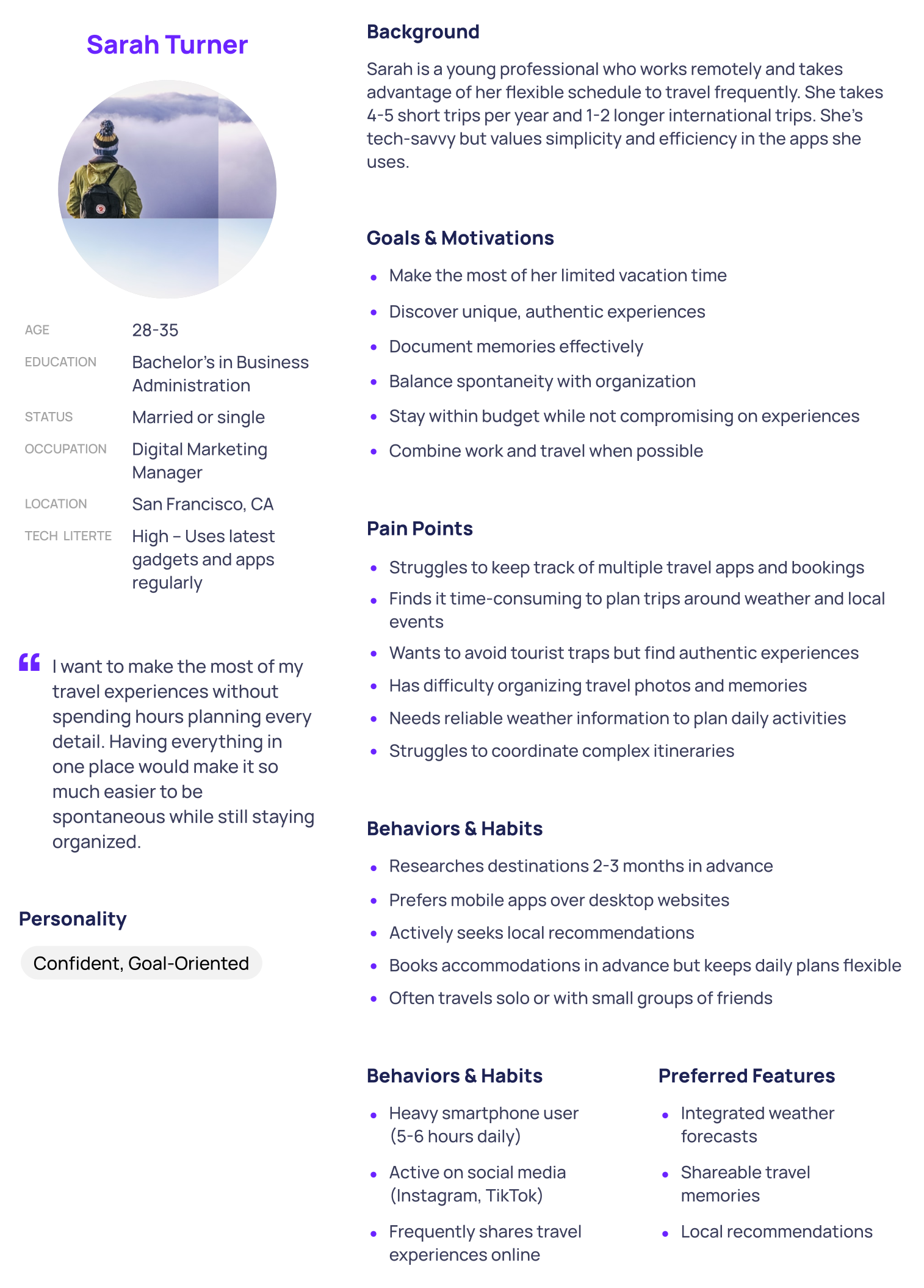
I thought about the target users for my project and imagined a typical traveler who values convenience and technology in their travel planning

2

I read travel blogs, user reviews of travel apps, and forum posts to understand common challenges and preferences of travelers.

3

Based on what I learned, I identified important traits, goals, and pain points that a user like Sarah might have.

4

Using these insights, I created Sarah Turner, a fictional character who represents my target audience. Her background, goals, and behaviors reflect the kind of user I want to design for.

Key Scenarios and Use Cases

1

Sarah uses the app to search for destinations within a 3-hour flight from her location, filters options by budget and activities, and books accommodations and experiences in one seamless flow.

2

After her trip, Sarah organizes photos, notes, and highlights from her travels in the app’s memory section. She can share her curated travel journals with friends or keep them private for future reference.

3

As a remote worker, Sarah uses the app to find work-friendly accommodations with good Wi-Fi, nearby coworking spaces, and local attractions to explore after work hours.

4

Sarah checks the app’s real-time weather updates to plan her day. On a sunny day, she books outdoor activities, while on a rainy day, she explores indoor attractions or food experiences.

5

Sarah plans a group trip with friends by creating a shared itinerary in the app. Each member can vote on activities and add their preferences, ensuring a collaborative experience.

Design Elements:

Color Scheme: A blue-white color palette

Typography: Roboto font family in various weights (10-14px sizes)

Consistent visual hierarchy across screens

Mobile-first responsive design

Clean, minimalist UI with focus on user content and photography

Technical Specifications:

Design Tool: Figma

Responsive layouts

Building interactive prototypes in Figma to simulate user interactions and gather feedback.

Creating low-fidelity wireframes to visualize layout and functionality before moving into high-fidelity designs.

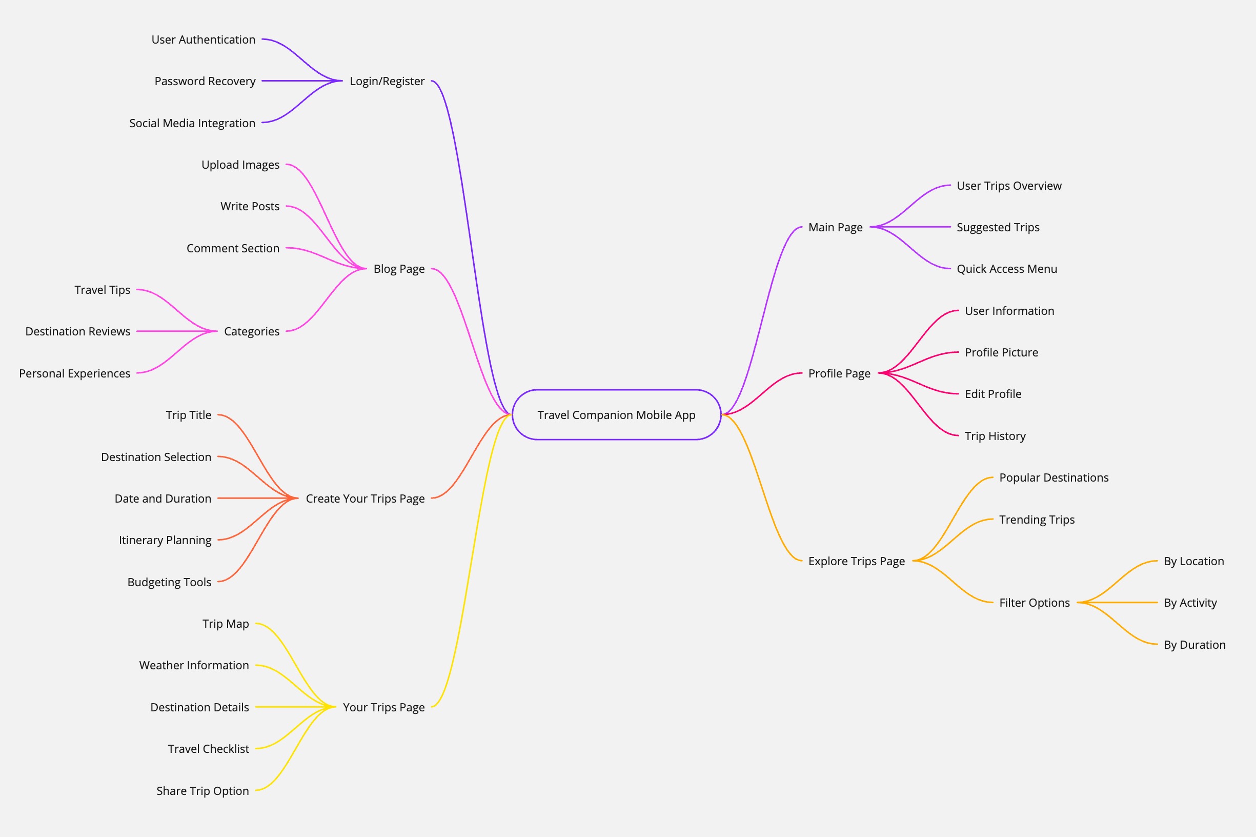
User Flow

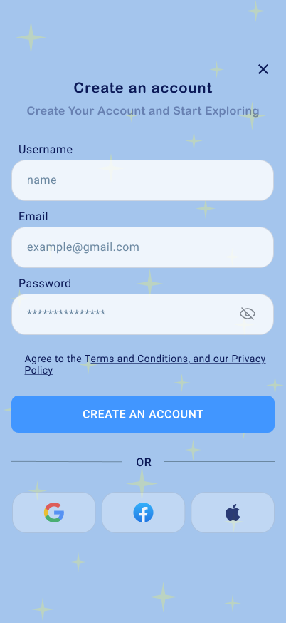
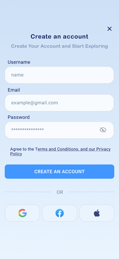
Login/Register Page

What I did

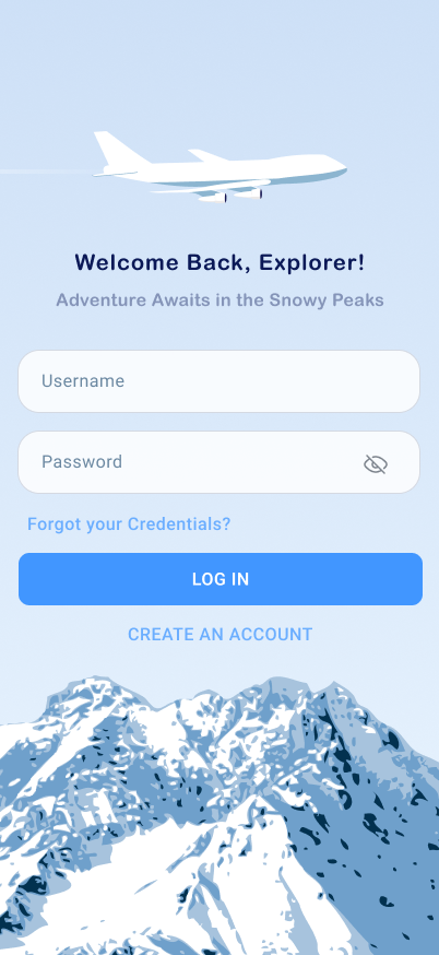
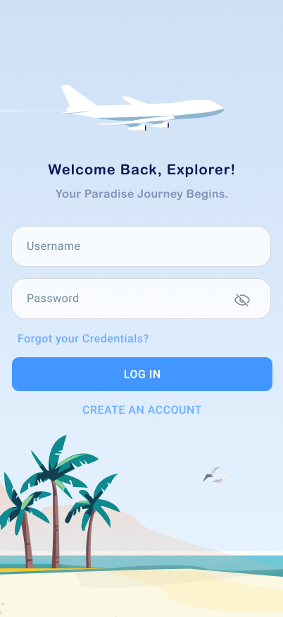
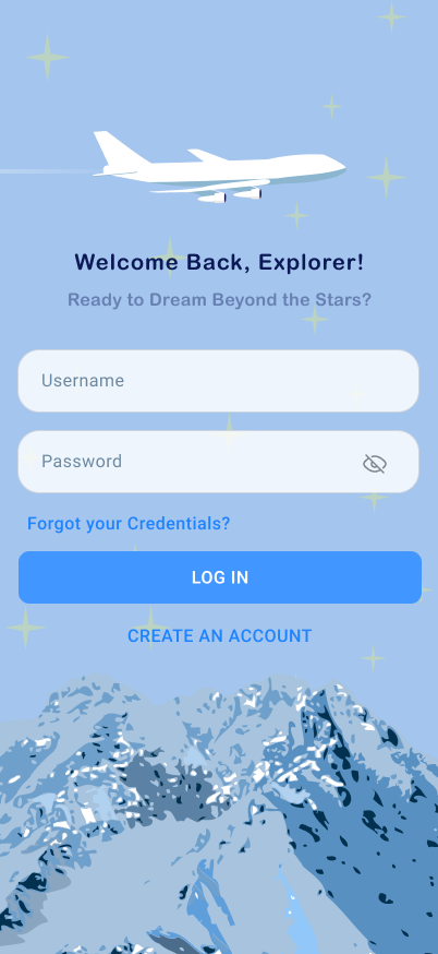
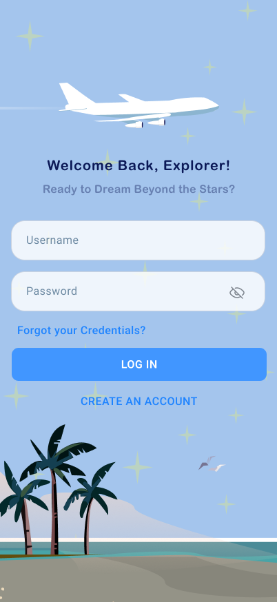
I designed login and account creation pages that change based on the season and time of day. This makes the app feel more personal and fun to use

The Idea

The goal was to create a unique and welcoming experience for users. I wanted the pages to feel like they fit the moment—whether it’s summer, winter, day, or night.

Why It’s Special

This project was all about making the user experience more enjoyable. By matching the look of the pages to the time of day or season, the app feels more connected to the user.

What’s Next

I’m excited to keep exploring ways to bring creativity and personalization into my designs.

Main Page

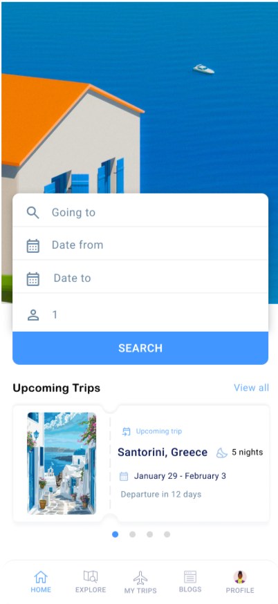
Overview

1

Clean search interface with destination and date inputs. Blue-orange palette chosen for trust and energy. Large search button for clear user action.

2

A preview card displays users' upcoming trips (e.g., Santorini, Greece) with key details like destination, duration, and travel dates. This ensures quick access to important trip information.

3

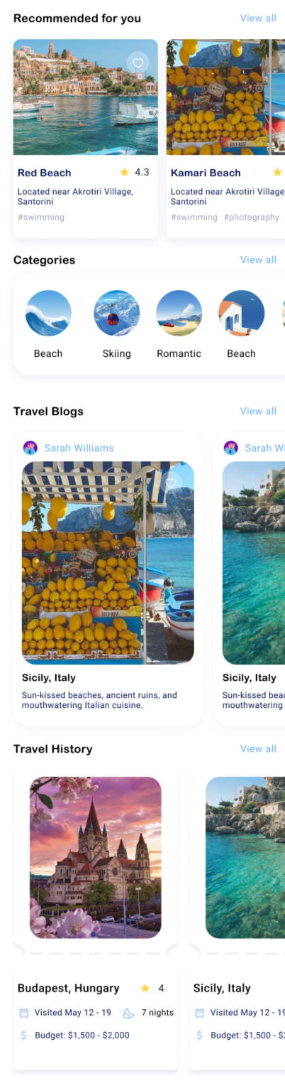
Curated destinations (Red Beach, Kamari Beach) with ratings and location info. Visual cards maintain clear information hierarchy.

4

Circular icons with minimalist designs provide quick access to categories like Beach, Skiing, and Romantic trips, enabling users to filter options without cognitive overload.

5

Featured blog posts with large, vibrant visuals and descriptive captions offer inspiration and insights for travel planning. These are user-generated to foster a sense of community.

6

Past trips display with dates and budgets (Budapest, Sicily). Helps track experiences and inform future plans.

7

A fixed navigation bar includes essential sections: Home, Explore, Trips, Blogs, and Profile. This ensures quick access to key features, maintaining a cohesive user experience.
My Trips

Overview

1

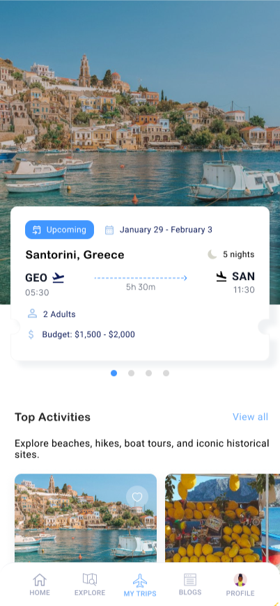
Displays essential trip information, including destination (Santorini, Greece), travel dates, budget range, and duration. The card integrates icons for transportation and travel companions for quick reference.

2

Highlights key activities, such as beaches, hikes, and historical sites, with horizontal scroll functionality and vibrant visuals to inspire exploration.

3

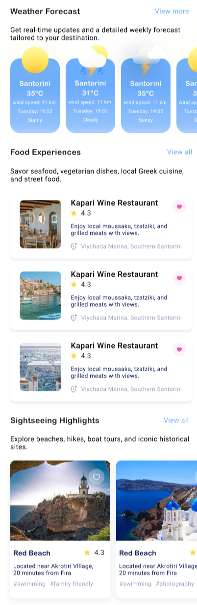
Provides real-time updates with an interactive, card-based display showcasing weather conditions tailored to the user’s selected destination.

3

Features curated dining options like Kapari Wine Restaurant, including ratings, location, and cuisine highlights to enhance the user’s gastronomic journey.

4

Prominently showcases top destinations (e.g., Red Beach) with high-quality images, distance details, and tags for quick filtering (e.g., "family-friendly," "photography").

5

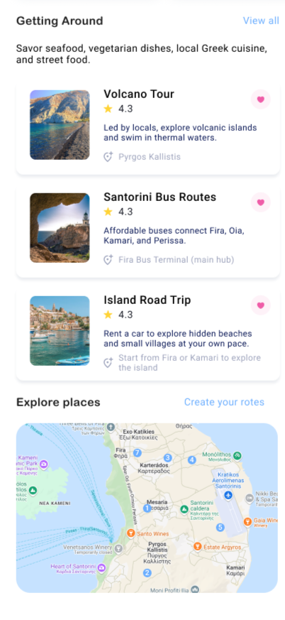
Lists options like tours, bus routes, and road trips with key details and user ratings to help travelers navigate the area effortlessly.

6

Displays a scrollable map with markers for key locations, offering an overview of popular spots and the ability to create personalized notes.

Profile

Profile Page: A Personalized Hub for Travelers

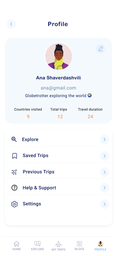
The Profile Page is the central hub where users can view and manage their travel activities while accessing essential features. Designed with simplicity and functionality in mind, this section creates a personalized experience for travelers by showcasing their travel journey and providing easy access to key options.

Core Features and Functionalities

1

A subtle pencil icon invites users to update their profile details effortlessly, whether it’s uploading a new picture, updating their name, or modifying their tagline.

2

With just a tap, users can dive into the app’s Explore feature, discovering new destinations, activities, and travel recommendations tailored to their preferences.

3

This section acts as a wishlist, helping users bookmark trips they’re considering for the future. It’s perfect for organizing ideas and planning upcoming adventures.

4

A detailed archive of completed trips allows users to reminisce about their journeys, review past itineraries, and even share memories with friends or fellow travelers.

5

From FAQs to live chat, users can resolve issues or get answers to their questions quickly.

6

The app provides flexibility for users to customize their experience, such as managing notifications, updating privacy preferences, or linking accounts.

Why It Matters

The Profile Page serves as more than just a section of the app; it’s the traveler’s personal space. It keeps users connected to their achievements, organized with their plans, and motivated to embark on new adventures. This design is not just about functionality—it’s about creating a delightful experience for travelers who want everything they need in one place.